Development of a UI Designer page as done at Bonitasoft, Part Two
In this article, I continue the step-by-step explanation of how user interface pages are developed by the Bonitasoft team.
by Dumitru Corini, Bonitasoft R&D Engineer
This article is a continuation of the article Development of a UI Designer page as done at Bonitasoft, Part 1 in which I talked about general page design choices, and then specifically about a list-styled page. In this article, I will detail the edit group modal. I chose to focus on this as it has most of the things you can find in other modals — and more.
Modal general decisions
To talk about modals, we first need to talk about the widget itself. The modal widget cannot be included inside another container in the whiteboard, which means that a UI Designer developer needs to choose where to put the container. When we started using the modal widget, our team decided to put modal widgets at the bottom of the editor, just as the UI Designer recommends.
Embed modal containers
Our team made a choice early in the development process to not allow a modal to be opened by another modal, so we had to look for other options when we had to decide how to edit something inside a modal. We wanted to simplify the user flow, because opening a modal inside another one raises questions about what would happen in the case of partial changes.
Keep the page consistent with changes made inside a modal
To keep the page consistent with the changes that are made inside a modal, we usually append a timestamp to the url that needs to be called. This way, if we update information in the groups list, all we have to do is modify the timestamp to trigger the API call again and get the recent changes.
Opening and closing a modal
Next up is our way of handling the closing and reopening of a modal. In the current UID state, there is no way of closing the modal easily since a modal can be closed in two different ways: with a button, and by clicking outside of it. Thus, there is no way to clean the modal state when closing the modal window. This causes problems when, for example, you have a modal state that is specific to an item; you close it and then open a modal for a second item. The state of the second modal will carry over some information from the first modal. Our solution was to clean the state of the modal upon opening.
Modal mock-up
Since the edit group modal is similar to the ones that we have already designed in other pages, we decided to not create a mock-up for this one in particular. Nonetheless, here’s a mockup of what we usually do for a modal:

Modal structure
To style the modal and separate its parts, we use three different containers in the modal and add the css classes “modal-header”, “modal-body” and “modal-footer” to the top, middle and bottom containers. That lets us separate the modal into three sections as you can see on the image above. I should mention that these are bootstrap classes and thus we don’t need to create css specially for them. In rare cases, if needed, we can tweak the style to, for example, add a bigger edge on the sides of the modal. In the case of the edit group modal, we didn’t change anything in the default bootstrap styles.
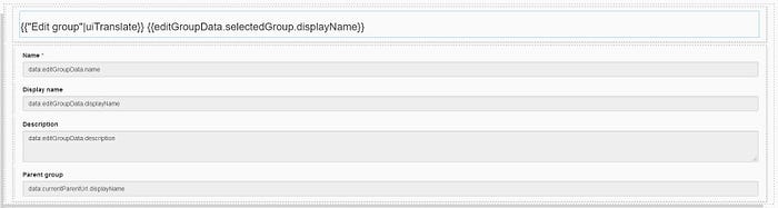
The edit group modal
This modal will be used by the end-user to modify a specific group. The fields that we let the end-user modify are the name, display name, description of the group, as well as the parent group.
Implement the edit group modal
As explained in Development of a UI Designer page as done at Bonitasoft, Part 1, whenever we work on a feature we try to use up to four variables. In this case, we will only create two : editGroupData and editGroupCtrl.
For the API call variable, we tried using one to get the information of the current parent, but as it was a bit too complex to manage, it became its own modular feature. I will talk about this feature later in the article.
The fourth variable type is a handler. I’m going to talk about it later as well since we decided to merge it with handlers of other page features.
And lastly, we have the two buttons at the bottom of the modal. I will talk about these at the end of the article.
How to open the modal
To avoid problems with states that persist after reopening a modal, initialize the modal with the item to edit when the modal is opened. This is then passed to the modal when it opens. To do this, add a function in the controller editGroupCtrl.
The function will look like this:
return { initEditGroupModal: function($item) { $data.editGroupData.selectedGroup = $item; return "editGroupModal"; }};
Also add the selected group to the data variable editGroupData, which will look like this:
return { selectedGroup: {}};
Next, use the initEditGroupModal function in the edit button, in the repeatable container list created in part one. Set the action of the button to Open modal, use an expression for the Modal id property, and then use editGroupCtrl.initEditGroupModal($item) as the value. Now, whenever we click the edit button in the list, it will call the initEditGroupModal function and pass the row item from the list as a parameter.
Use this selected group to show the display name of a group inside the modal-header container:
{{"Edit group"|uiTranslate}} {{editGroupData.selectedGroup.displayName}}This should be good for the modal title.
Edit the group’s simple fields
Since we want to make the modal the same as the one in the current portal, we will provide the end user with the ability to modify fields like name, display name, description and parent group. The first two will be simple input fields, and we decided to use a text area for the description since it would display better. I will go into detail about the parent group a bit later since modifying it is a bit more complex.
Let’s backtrack a bit and talk about the editGroupData variable again and its use in the above mentioned fields. The variable will be used to keep the values of the input fields during the runtime. Thus, its updated value will be:
return { name: "", displayName: "", description: "", selectedGroup: {}};
Use the editGroupData.name for the name input, and name the other inputs accordingly.
The initEditGroupModal function also needs to be updated to show the values of the display name, name and description when the user opens the modal. To do this, add these lines:
$data.editGroupData.name = $item.name;$data.editGroupData.displayName = $item.displayName;$data.editGroupData.description = $item.description;
Another way to do this would be to use the fields of the object selectedGroup instead of three individual fields (name, displayName, description).
Let’s talk about the parent group now. Since the API request for the group returns an id for the parent group and we want the display name, we will need to do an API call currentParentUrl to get the information. Since the parent of our group is another group, the API call will look something like this: ../API/identity/group/{{editGroupData.selectedGroup.parent_group_id}}.
Add an input field and use the currentParentUrl.displayName to display the current parent group.
You should have something like this:
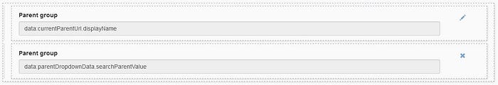
Edit the parent group
What we have done so far is display the current parent group, and now we want to be able to edit it. Since we already made a decision to not open a modal by another modal, our team next decided to go with an input that has two states (view and edit). We also wanted to let the user be able to go back to the current parent group if they changed their mind midway through the choice of a new parent group.
To make this modular, we created three variables (currentParentUrl, currentParentData and currentParentHandler). For the currentParentData, we used:
return { currentParentId: undefined, timestamp: 0};
We also changed the currentParentUrl to ../API/identity/group/{{currentParentData.currentParentId}}?t={{currentParentData.timestamp}} and added $data.currentParentData.currentParentId = $item.parent_group_id; to the initEditGroupModal to reset the current parent when opening a new modal and $data.currentParentData.timestamp = new Date().getTime(); to get the information for the new parent.
If the currentParentId is the same when we enter the modal, there is no need for an API call to get the parent information.
Switch between the view and edit states
Next add the second (edit) state, and a button next to each one of the inputs to switch between the two states. You should have something like this:
For these buttons to change the state, we will use a collection of actions. Whenever the end user clicks on one of the buttons, we will add a value into this collection. The handler will then catch and treat the action that was added.
First add the array to the currentParentData. We also need a variable that will keep the current state (editingParentGroup). After these additions, the data variable should look something like this:
return { currentParentId: undefined, actions: [], editingParentGroup: false};
Now, set the button actions to Add to collection. The position in the array where you add the value doesn’t really matter, but the value to add should be edit for the first one and cancel for the second one.
Let’s talk about the last piece of the puzzle, the handler.
Its value will be this:
if ($data.currentParentData.actions[0] === "edit") { $data.currentParentData.editingParentGroup = true; $data.currentParentData.actions = [];}if ($data.currentParentData.actions[0] === "cancel") { $data.currentParentData.editingParentGroup = false; $data.currentParentData.actions = [];}
This changes the state, and empties the actions array to execute the action only once.
For these values to be taken into account, use this field in the two input field containers. Use currentParentData.editingParentGroup as an expression for the hidden property value of the first button, and !currentParentData.editingParentGroup for the second.
Don’t forget to change the initEditGroupModal function to reset the values of the above fields when the user opens the modal. Simply add these lines to the function:
$data.currentParentData.currentParentId = $item.parent_group_id; $data.currentParentData.editingParentGroup = false;
Implement the edit state
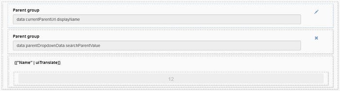
Now that you can change between the view and edit state, make the edit state work. As there is an autocomplete in the portal, we wanted to have something similar here. The catch is that the autocomplete widget that is provided in the UID doesn’t support returning an entire object — it only returns one field from the object.
Returning an entire object is important since we want to have both the id of the selected item and the display name to display. (Note that there is a fix in the 2021.1 version of the UI Designer that will let you return an entire object. We will update the pages accordingly.)
Since this fix is not yet here, the current implementation of a custom autocomplete uses a repeatable container. To do this, put the two parent group inputs into a single container and add another container for the autocomplete suggestions of possible parent groups. Display a text widget title with the value <strong>{{"Name" | uiTranslate}}</strong> to tell the end user to choose between the names of the parent groups. The container added under the Name title will be a repeatable container and, thus, it will have one option per row, just like we did with the list in part one. We will set the value of the collection property for this container later.
You should have something like this:
Get the list of possible parent groups
Now, for the functional part. We created a full-fledged feature module here since it will also be used by the create group modal.
The first variable is parentDropdownData. Its value is:
return { searchParentValue: "", selectedParentDisplayName: undefined, selectedParentId: undefined, selectedParent: []};
searchParentValue is used as the value of the input. The selectedParent acts as a sort of action array when a parent is selected, from which selectedParentDisplayName and selectedParentId are extracted.
We extract these because we found it easier to work with $data.parentDropdownData.selectedParentDisplayName instead of $data.parentDropdownData.selectedParent.displayName, but you can use the the second option if you want.
Since we have the data, we can use parentDropdownData.searchParentValue as the value of the edit state input.
The second variable is the parentDropdownUrl. Its value is ../API/identity/group?p=0&c=20&o=name&s={{parentDropdownData.searchParentValue}}.
When the value is defined in the variable itself, an API call will be made when the page is opened and there will be no value for parentDropdownData.searchParentValue. So to fix this, create the third variable, parentDropdownCtrl and add a function:
getParentSearchUrl: function() { if ($data.parentDropdownData.searchParentValue && $data.parentDropdownData.selectedParentDisplayName !== $data.parentDropdownData.searchParentValue) { return "../API/identity/group?p=0&c=20&o=name&s=" + $data.parentDropdownData.searchParentValue; } return undefined;}
If an API call variable has undefined in it’s value then the API call is not made. So, first check if there is a value in the input; if there is no value, there is no need to do an API call. Next check if the value entered is the same as the one that is selected, so the API call is not made again.
(Imagine you want to look for Acme and you type A. An API call will be made to search for A. When you select Acme from the returned values, there is no need to redo an API call with Acme.)
Use {{parentDropdownCtrl.getParentSearchUrl()}} as the value for parentDropdownUrl.
Now that there is an API call, there is another thing to consider before displaying the result. Displaying the full list of possible parents could introduce possible performance issues, so we went with displaying only 20 and then telling the user to type more. To do this, append the Or type more to the list of 20 elements. We can add this to parentDropdownCtrl:
getFullSearchParentList: function() { var fullParentList = $data.parentDropdownUrl; if (fullParentList && fullParentList.length == 20) { fullParentList.push({ displayName: uiTranslate("Or type more...") }); } return fullParentList; }
To display the list of parents, use parentDropdownCtrl.getFullSearchParentList() as the collection property value of the repeatable container.
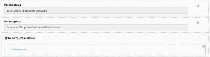
Select a parent group from the list
Now add a button in the repeatable container that, when clicked, triggers the selection of a parent group. To make it prettier, we went with a style property link. Like the other action trigger, the button has Add to collection as the action property. The collection would be parentDropdownData.selectedParent and the value is an expression with the value $item. This lets you add the selected parent group object into the array. For the label, use {{$item.name}} to display the name of each item in the repeatable container.
Then, create the fourth and last variable parentDropdownHandler. Like the one for switching between the view/edit states, this one will catch a variable state, perform an action and clean the variable so the action is done only once. To do this:
if ($data.parentDropdownData.selectedParent && $data.parentDropdownData.selectedParent.length > 0) { $data.parentDropdownData.searchParentValue = $data.parentDropdownData.selectedParent[0].displayName; $data.parentDropdownData.selectedParentDisplayName = $data.parentDropdownData.searchParentValue; $data.parentDropdownData.selectedParentId = $data.parentDropdownData.selectedParent[0].id; $data.parentDropdownData.selectedParent = [];}
This sets the input field to the value selected, extracts the two fields that we want and cleans the selected parent, so the action is not re-triggered.
Now for the finishing touches for the autocomplete. Since the user should not be able to click on Or type more, add a function that will make the option unclickable. To add into the parentDropdownCtrl:
isSearchParentMore: function(item) { return item.name === uiTranslate("Or type more...");}
Use this function by using a disabled expression with the value parentDropdownCtrl.isSearchParentMore($item). This will check if the item has the value of the field name equal to Or type more and disable it.
If you run this, you should see a small problem: the dropdown is always visible. To fix this, use an expression for the hidden property of the repeatable container with the value parentDropdownCtrl.hideDropdownMenu(). This function checks if there has been no API call response for the parentDropdownUrl. If the response is empty (no parents are available with the current search value) or if the current search value is empty (nothing in the input):
hideDropdownMenu: function() { return !$data.parentDropdownUrl || $data.parentDropdownUrl.length === 0 || $data.parentDropdownData.searchParentValue === "";}
Then clean the parentDropdownUrl when a value is selected so the suggestion box disappears. Add $data.parentDropdownUrl = undefined; to the parentDropdownHandler.
And you should be good for the autocomplete. The end result will look like this:
Style of the autocomplete
Before continuing, let’s look at the styling of what was just done. Let’s start by adding the css classes. If you look at the image above, the bottom container uses the class dropdown dropdown-parent-group, while the container that displays the names of the possible parents uses dropdown-menu. We use the dropdown and dropdown-menu classes from bootstrap and add dropdown-parent-group to be able to override the default definition with a more specific CSS class.
Also add this to the style.css file:
.dropdown-parent-group .dropdown-menu { /* so that it stays on screen and avoids a scrollbar in the modal */ position: relative; display: block; /* to make it’s width the same as the input width*/ width: 95%; /* to align it with the parent group input */ margin-left: 15px; padding-left: 10px;}.dropdown-parent-group .dropdown-menu button { /* ellipsis */ white-space: nowrap; overflow: hidden; text-overflow: ellipsis; text-align: left; /* for it to not surpass the size of the entire container */ width: 98%;}.dropdown-parent-group .dropdown-menu button:hover { /* so that it shows which item is selected */ background: #2c3e50; color: #fff; /* so that some things are removed */ text-decoration: none;}
The action buttons
There are two action buttons in the modal footer. Let’s look at the first one, the Save button. This button will be used to make a PUT API call with the URL ../API/identity/group/{{currentParentData.currentParentId}}. Next, create the payload that will be sent when the end user clicks on the button. Create a function in editGroupCtrl called getEditGroupPayload:
getEditGroupPayload: function() { return { name: $data.editGroupData.name, displayName: $data.editGroupData.displayName, description: $data.editGroupData.description, parent_group_id: $data.parentDropdownData.selectedParentId };}
This function will create a json object with the values that have been input by the end user. You can now use this function (editGroupCtrl.getEditGroupPayload()) in the Data sent on click property of the button. Don’t forget to set it as an expression, since the value needs to be calculated instead of being interpreted as text. Two things should be done when we get a response. The first is to show an appropriate message depending on the response of the API call. The second is to refresh the list in the background.
Tackle these one at a time. For the first one, add statusCode: "" to the editGroupData and use it in the HTTP status code property field (editGroupData.statusCode). You can then add text fields that will be hidden if the value of the statusCode is different than the one for the message.
For example, here are three uses of this variable:
- Use in case of a success. The hidden value should be
editGroupData.statusCode !== 200. The message will be hidden if the API call response status code is not 200. - Use in case of an error. The hidden value is
editGroupData.statusCode === "" || editGroupData.statusCode === 200. It will be hidden if there is no statusCode (when no API call was made) or when the API call is a success. - Use in case of a specific error code, but where multiple errors are possible. For example, the group API returns a 403 if the user is not authorized to access the API and if a group already exists with the same name. To treat this, use a variable
failedResponsein the failed response value and a functiongetErrorMessageFor403that will take the failed response and return an error message. It will look like this:
getErrorMessageFor403: function(failedResponse) { if (failedResponse && (failedResponse.exception.indexOf(‘AlreadyExistsException’) > -1 || failedResponse.message.indexOf('AlreadyExistsException') > -1)) { return uiTranslate("A group with the same name already exists."); } return uiTranslate("Access denied. For more information, check the log file.");}
All this does is check if the error is of type AlreadyExistsException, by checking if that text exists in the exception or the message of the failed response. The text can be customized as you please. To use it in a text widget, use {{editGroupCtrl.getErrorMessageFor403(editGroupData.failedResponse)}} as the value.
Refresh the list of items after an API call
Let’s backtrack a bit and talk about refreshing the list of groups that should happen behind the modal. Just as the parentDropdownHandler treats the response of the API call for the possible parents, create a refreshHandler that will allow editing a group. First, add a timestamp field in the groupsData and add &t={{groupsData.timestamp}} at the end of the groupsUrl. As explained at the beginning of this article, updating this timestamp will trigger the API call again. The rest should be simple - when there is a successful API call for the save button, change the groupsData.timestamp:
if ($data.editGroupData.statusCode === 200) { $data.groupsData.timestamp = new Date().getTime();}
This implementation has a huge flaw though: it will cause an infinite loop of refreshing the page when the group has been successfully edited. This is because the value of the field statusCode in editGroupData stays at 200, and the timestamp keeps changing every time there’s an action on the page (like, for example, an API call response that arrives). The easiest way that we found to fix this is to have an additional variable that will see if a group has been updated recently. Add hasRecentlyBeenEdited to the editGroupData. Change the refreshHandler code to take this field into account:
if ($data.editGroupData.statusCode === 200 && !$data.editGroupData.hasRecentlyBeenEdited) { $data.groupsData.timestamp = new Date().getTime(); $data.editGroupData.hasRecentlyBeenEdited = true;}
And, again, don’t forget to reset its value in the initEditGroupModal function:
$data.editGroupData.hasRecentlyBeenEdited = false;You can disable the button when the name value is empty. Add editGroupData.name === "" as an expression for the disabled property of the Save button. You can also disable all the fields after an update by checking that the hasRecentlyBeenEdited value is true.
The last thing to consider for this modal is the cancellation button in the modal footer. If there is a successful update of the group, the label Cancel might make the end user think the update could be cancelled, so change the label to Close. This is done, once again, with the use of a function:
getChangeButtonLabel: function(statusCode) { return statusCode === 200 ? uiTranslate("Close") : uiTranslate("Cancel");}
We added this to the groupsCtrl since it’s also used in other modals.
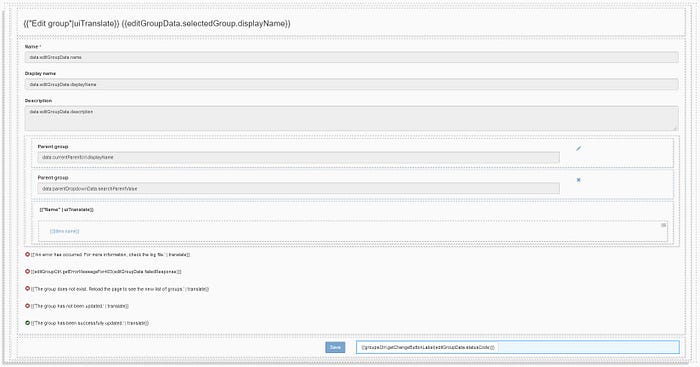
This is how the full modal looks in the end on our side.
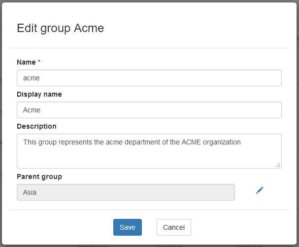
And this in the preview:
Conclusion
So, now you know how we develop a modal with the UI Designer and you can do the same, with all the tips and tricks that we employed, like how to use a UID button to trigger an action on the page, how to create an autocomplete widget custom implementation, and how we treat errors using an API call response.
And, as mentioned in Part 1, the next step is to create tests. You can find more information about how to test a Bonita UI Designer page in this article. You can also find everything about this development and more in our web pages project.
This article was originally published in the Bonitasoft Community blog.